



Best Linen Sheet Colours for Every Bedroom
Choosing the best linen sheet colour is rarely just about colour itself. It is about how a room feels at 6 am, how the light lands in the afternoon, and whether your bedroom feels settled the moment you walk in. The best linen sheet colours are the ones that work with your space, your habits and the kind of atmosphere you want to come home to.
Because linen has a naturally relaxed finish, colour behaves differently on it than it does on crisp cotton or synthetic blends. For instance, a white linen sheet set feels softer and more lived-in than stark, and a deep olive feels grounded rather than heavy. That is part of linen’s appeal - it brings ease to colour, even when the palette is refined.
What makes the best linen sheet colours work
The most successful shades do two things at once. They sit comfortably within the room, and they still feel good to live with every day. That second part matters more than people expect.
A beautiful tone in a showroom can feel tiring in a real bedroom if it clashes with your flooring, throws off the light, or asks too much of the rest of the styling. The best choice is usually one that feels considered but not forced. Linen is tactile and textural, so colours with a slightly muted or natural quality tend to age more gracefully than anything too sharp or overly cool.
If your bedroom is a place to reset, softer and more grounded tones usually have the longest appeal. If it is also your reading nook, weekend retreat and morning coffee spot, the palette needs to hold up across all those moments.
The best linen sheet colours by mood
White and Ivory for a light, quiet look
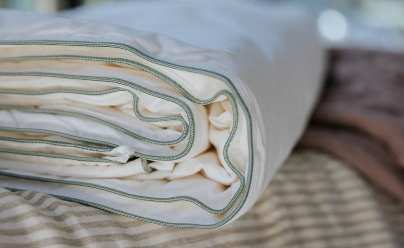
White remains a classic for good reason. On linen, it feels airy rather than clinical, especially in rooms with warm timber, textured throws or soft natural light. If you want the bed to feel fresh, simple and quietly premium, white is hard to fault.
Ivory or off-white shade linen can be even more forgiving. It softens the contrast in the room and tends to flatter both cooler and warmer interiors. If pure white feels a little too sharp for your taste, then an ivory colour gives you the same sense of calm with more warmth.
These shades suit minimal bedrooms beautifully, but they also work in layered spaces where you want the bed to act as a visual pause.
Oatmeal, sand and beige for warmth without fuss
Warm neutrals are often the easiest answer when you want a bedroom to feel elevated without looking overstyled. Oatmeal, sand, flax and beige tones have enough depth to create interest, but they stay versatile.
These colours are especially effective in Australian homes where light can be bright and interiors often lean natural. Against oak, rattan, travertine, brushed brass or creamy walls, they feel effortless. They also hide creasing a little more softly than white, which suits linen’s relaxed character.
If you are building a bedroom palette from scratch, this is often the safest place to start. Not boring - simply enduring.
Grey for a cooler, more tailored finish
Grey linen sheets can look very polished, but the exact tone matters. A soft stone grey feels calm and contemporary. A deeper charcoal introduces contrast and can make the bed feel more structured.
The trade-off is warmth. In a south-facing or naturally dim room, cooler greys can flatten the space if there is not enough texture elsewhere. They work best when balanced with timber, soft lighting, warm-toned walls or layered neutrals.
If you prefer clean lines and a more restrained interior, grey can be one of the best linen sheet colours. Just choose a version with softness rather than a steely edge.
Olive, sage and eucalyptus for an organic feel
Muted greens have become modern staples because they sit so naturally with linen. Sage feels light and restorative. Olive feels deeper, moodier and more enveloping while Eucalyptus lands somewhere in between - fresh, but still grounded.
These shades pair well with natural materials and give a bedroom a calm, collected feel without defaulting to beige. They are particularly good in homes that already feature earthy ceramics, warm woods or a softly tonal palette.
Green is also one of the easier colours to live with long term. It reads as a colour, but not a loud one.
Clay, rust and terracotta for depth and warmth
For a bedroom that feels sun-warmed and inviting, earthy reds and clay tones are hard to beat. In linen, these shades can feel rich without becoming formal. They bring depth, especially in neutral rooms that need a little more character.
The nuance here is saturation. A muted terracotta or dusty clay tends to feel sophisticated. A brighter rust can be beautiful too, though it is more directional and may ask for a simpler room around it.
These tones work especially well with cream walls, timber furniture and soft natural fibres. They are less universal than oatmeal or white, but when they suit the room, they are memorable.
Blue for softness with a cooler edge
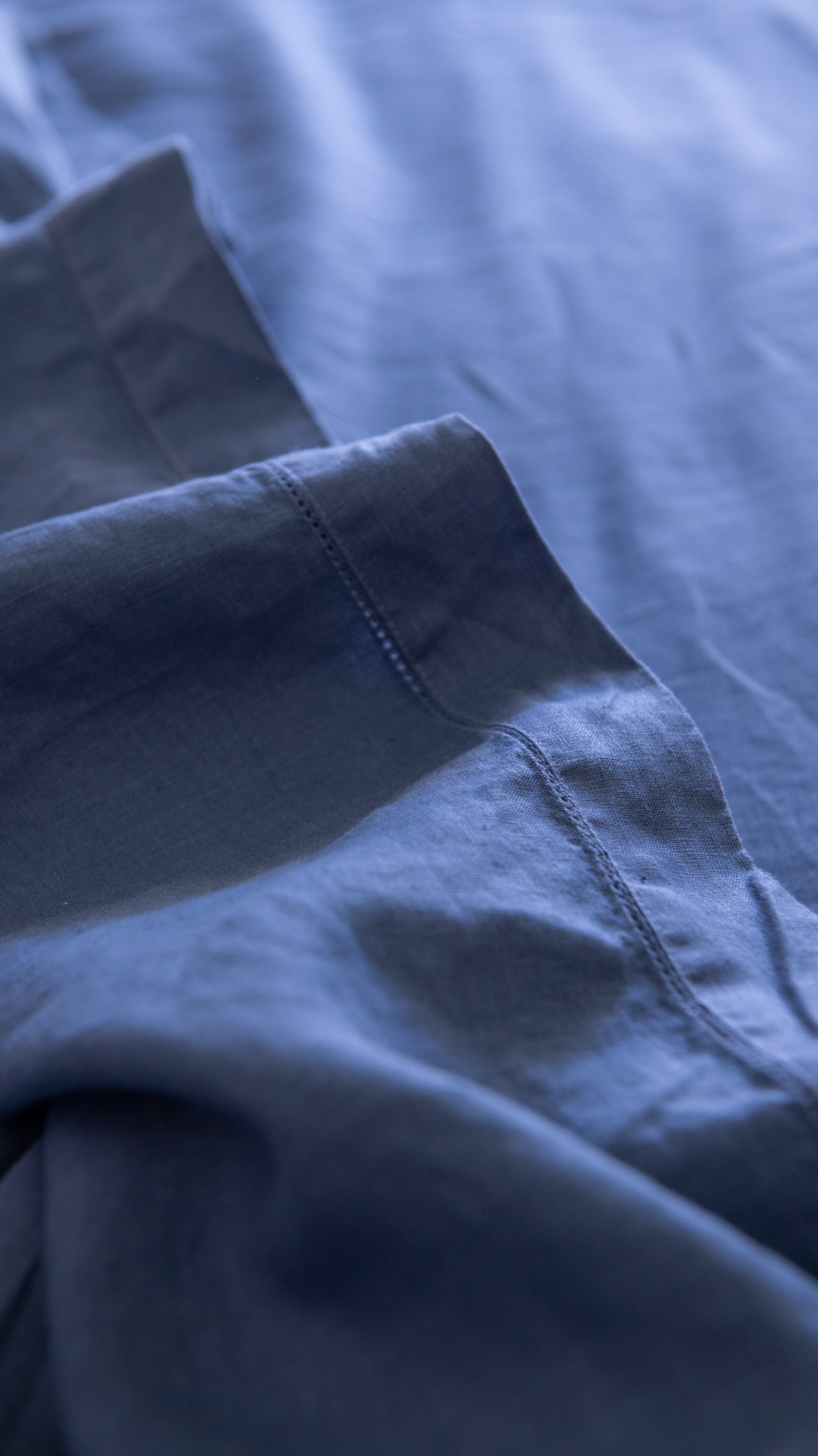
Blue is often chosen for its connection to calm, but on bedding it can range from breezy to dramatic. Powdered blue and washed denim tones feel relaxed and coastal without becoming thematic. Deeper navy brings contrast and a cocooning effect.
The key with blue linen is to keep it slightly muted. Linen already has texture and movement, so overbright shades can feel out of step with the fabric. A softened blue sits far more naturally and keeps the room feeling composed.
If your bedroom gets a lot of warm light, blue can add balance. In cooler rooms, it may need warmer accents nearby.
How to choose the right linen sheet colour for your room
The room itself should guide the decision. Start with the light - bright rooms can handle cooler or deeper shades because sunlight softens them, whereas dimmer rooms usually benefit from warmer neutrals, soft whites or greens that keep the space from feeling closed in.
Then consider what already stays in the room year-round. Flooring, bedhead, bedside tables, curtains and wall colour matter more than seasonal cushions or a throw you might swap out later. Linen sheets should feel integrated, not isolated.
It also helps to think about contrast. If your walls and furniture are pale, a mid-tone sheet colour such as olive, clay or stone can add shape to the room. If the room already has strong elements - dark timber, coloured art, statement lighting - a quieter sheet colour may bring more balance.
Lifestyle matters too. If you want a bed that always looks crisp and bright, white or ivory may still be your favourite. If you prefer something forgiving and softly styled, warm neutrals, sage or deeper earthy shades tend to feel easier day to day.
Best linen sheet colours for mixing and layering
Linen is at its best when the bed does not look too matched. A little variation gives the whole space more depth. That could mean ivory sheets with an olive duvet cover, or oatmeal sheets under a white quilted layer.
The easiest combinations stay within a similar temperature. Warm shades usually sit well together - think sand, clay and ivory. Cooler shades can work too, though they often need one warmer element to stop the bed feeling flat. Grey with oat, or sage with cream, tends to look more inviting than an entirely cool palette.
If you are mixing colours for the first time, keep one base neutral and add one accent tone. That creates interest without making the bedroom feel busy.
When trend colours are worth it
Trend-led shades are not automatically the wrong choice. In fact, linen softens many of them beautifully. The question is whether you genuinely want to live with that colour beyond the season.
Because linen bedding is an investment, it makes sense to choose tones you will still want next year. If you love a more current shade - perhaps a deep cocoa, a dusty rose or a smoked blue - it can be worth introducing it as a top layer or pillowcase first. That way the bed still feels fresh, but the foundation remains versatile.
For most bedrooms, longevity beats novelty. The best linen sheet colours are not necessarily the boldest or the most photographed. They are the shades that keep your room feeling settled, soft and well considered over time.
A colour choice that still feels right in six months
There is no single best colour for every bedroom, only the one that fits your light, your materials and your sense of home. White and ivory feel timeless. Oatmeal and sand offer quiet warmth. Olive, clay and muted blue bring personality without excess.
If you are choosing carefully, favour colours with a softened, natural finish - the kind that look better with wear, not worse. That is where pure flax linen excels. It does not ask for perfection. It simply makes everyday living feel more refined.
The most beautiful bedrooms are rarely built around a dramatic decision. More often, they come together through calm, tactile choices that keep feeling right long after the bed is made.


Leave a comment
This site is protected by hCaptcha and the hCaptcha Privacy Policy and Terms of Service apply.